New

New Update Changed Icons - Not Good

Related products:Orders & Shipment Management
  • February 11, 2026
  • 4 replies
  • 52 views

e_sorensen23

Hi,

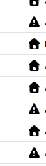
With this recent update to Shipstation, the icons have changed to a solid flat black, instead of being green for a validated address and yellow exclamation point for address verification needed. This color coding is ingrained into our workflow; it is how we are able to correct issues quickly when processing 100’s to 1000’s of orders. I get always having a new version release makes investors happy, but please revert this change back to the original color scheme, the classic if it is not broke do not fix it. See attached screenshot if not familiar with what I am speaking of. Thanks!


February 12, 2026

This looks to be corrected, thank you shipstation for listening to your customers needs!

4 replies

Daylon
  • Employee
  • February 11, 2026

100% agree! I can get over the icons not looking the same, but the colors need to be different for those icons. It’s like a step backwards.


scott28
  • Employee
  • February 11, 2026

Regarding the UI update: The move to hollow-outline icons for invalid addresses has created a bottleneck in our correction and shipping process. Without solid color-coding, our team cannot distinguish between "Warning" and "Errors" without manual inspection. For high-volume merchants, this lack of visual contrast is a major regression in usability. Please restore solid color indicators for address verifications.


e_sorensen23
  • Author
  • Employee
  • February 12, 2026

This looks to be corrected, thank you shipstation for listening to your customers needs!


Daylon
  • Employee
  • February 12, 2026

Whew! Yes, definitely glad they listened. I’ve noticed some random icons here and there are a lot smaller now. Really nothing major, just odd.


BWP
  • Employee
  • February 13, 2026

I’ve tried clearing cache and refreshing, but my icons are all still black. Anyone know how to fix?