- ShipStation Community
- Discussions
- ShipStation Features
- Piling on on the new layout - not designed for me
- Subscribe to RSS Feed
- Mark Topic as New
- Mark Topic as Read
- Float this Topic for Current User
- Bookmark
- Subscribe
- Mute
- Printer Friendly Page
Piling on on the new layout - not designed for me
- Mark as New
- Bookmark
- Subscribe
- Mute
- Subscribe to RSS Feed
- Permalink
- Report Inappropriate Content
02-02-2024 11:55 AM
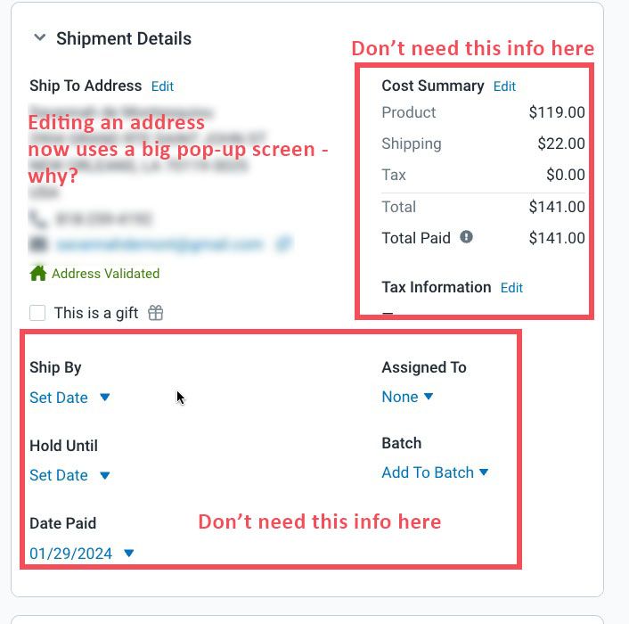
I know it's traditional to hate a new interface - it's just human nature I guess.
But I have to speak up on this latest because it's reduced my efficiency. Previous version was more compact and grouped things I actually used within easy reach. Now ? Wasted space, more clicks. Maybe this layout is great for shippers with a different business, but it's a downgrade for us.
- Labels:
-
layout
- Mark as New
- Bookmark
- Subscribe
- Mute
- Subscribe to RSS Feed
- Permalink
- Report Inappropriate Content
02-02-2024 12:24 PM
I agree the new layout it more time consuming!
- Mark as New
- Bookmark
- Subscribe
- Mute
- Subscribe to RSS Feed
- Permalink
- Report Inappropriate Content
02-02-2024 01:47 PM
It's a downgrade for us as well, but for additional reasons. I'm no longer able to see who the purchaser is, only the recipient. This means we're not able to determine if we're dealing with a gift (i.e. purchaser different than recipient) or someone ordering for themselves (purchaser = recipient).
Where was the customer requirements gathering for this 'upgrade'?
- Mark as New
- Bookmark
- Subscribe
- Mute
- Subscribe to RSS Feed
- Permalink
- Report Inappropriate Content
02-05-2024 09:34 AM
The new layout definitely does not work for our shipping team. Our team uses tags frequently and now the tags take extra clicking and fewer can be seen without having to scroll. Same for the shipping services. We now have to scroll to see all the services. This causes more errors and more time. Also, the quantity used to be a bright red number when it was more than 1. Now it doesn't stand out.
I really wish the Order Summary could be at the top again. It is not natural for your eyes to have to go left to right and then up and down. Before you only had to scan up and down which felt very natural.
My shipping team really hates it. I'm looking at other options now.
- Mark as New
- Bookmark
- Subscribe
- Mute
- Subscribe to RSS Feed
- Permalink
- Report Inappropriate Content
02-06-2024 03:38 PM
Another big fail by the SS UX/UI team.
This new update has added time to many of our processes. For one, when printing individual labels/packing slips, the 'Printing' notification pops up on top of the action buttons requiring you to either wait, or click to close it. Again, more steps, more time, more waste. I really don't know how all of these changes make it through...
- Mark as New
- Bookmark
- Subscribe
- Mute
- Subscribe to RSS Feed
- Permalink
- Report Inappropriate Content
02-08-2024 06:15 PM
I completely agree. I NEVER have multiple shipments to deal with.
Can we please have the option (Like my Etsy marketplace does)
To use the older version as an option?
- Mark as New
- Bookmark
- Subscribe
- Mute
- Subscribe to RSS Feed
- Permalink
- Report Inappropriate Content
02-08-2024 06:18 PM
Please give us the option to opt out of this version and use the previous more streamlined version
that was more compact and made so much more sense!