- ShipStation Community
- Discussions
- ShipStation Features
- A Foxy-Cart inspired email notification template
- Subscribe to RSS Feed
- Mark Topic as New
- Mark Topic as Read
- Float this Topic for Current User
- Bookmark
- Subscribe
- Mute
- Printer Friendly Page
A Foxy-Cart inspired email notification template
- Mark as New
- Bookmark
- Subscribe
- Mute
- Subscribe to RSS Feed
- Permalink
- Report Inappropriate Content
11-19-2020 07:53 AM
Original post from user Andrew54CA1
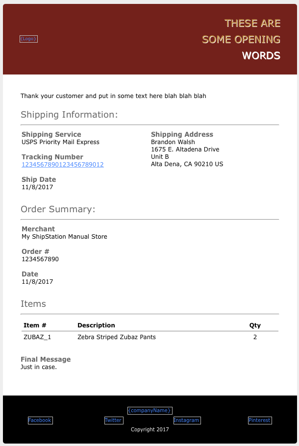
So, I HATE the default shipping template. It's . . . awful. However, the default template that FoxyCart provides is pretty well done, so I decided to create a FoxyCart-inspired email template to make my store's branding more consistent. I had already tweaked the defaults on FoxyCart to match my branding before creating my ShipStation template (so this isn't a direct copy of their standard formatting), but hopefully, it will get people started or give them a more eye-catching alternative.
I THINK I've cleaned up most of the unnecessary breaks/leftover blocks/etc, but there may still be some embarrassing messes in there from fitting FoxyCart's square peg into ShipStation's a round hole. Make sure to edit the stuff in {curly braces}. Other than that, I hope someone finds this to be useful!
You can copy the HTML from this public Pastebin link.
Here is an image of the raw template...
- Labels:
-
Custom Templates
- How to edit email templates in ShipStation Features
- Inquiry About Email Notifications for Failed Deliveries in ShipStation Features
- [Feature Request] Automation Rule for No Shipment or Delivery Notification in ShipStation Features
- BUG! Shopify marketplace notifications broken in Order Source Integrations
- Consolidated shipping notification for USPS shipments with multiple packages in ShipStation Features
