- ShipStation Community
- Discussions
- ShipStation Features
- New layout when selecting carrier and service
- Subscribe to RSS Feed
- Mark Topic as New
- Mark Topic as Read
- Float this Topic for Current User
- Bookmark
- Subscribe
- Mute
- Printer Friendly Page
New layout when selecting carrier and service
- Mark as New
- Bookmark
- Subscribe
- Mute
- Subscribe to RSS Feed
- Permalink
- Report Inappropriate Content
07-30-2021 04:51 PM
Wow the new layout is absolutely horrible, it's now very difficult to tell which carrier and service you are looking at. Please go back!!!!
- Mark as New
- Bookmark
- Subscribe
- Mute
- Subscribe to RSS Feed
- Permalink
- Report Inappropriate Content
08-09-2021 01:31 PM
Hey @Kennyd,
Thanks for taking the time to post in the Community!
Im sorry to hear that you are not enjoying the new layout. Just to be totally up front with you, we are not going to move back to the old layout. I don't want to lie to you about our options moving forward. What I DO want to do is get some more detailed information from you about how this new layout is making finding your carrier/service more difficult! Perhaps I can help make that process easier! Any sort of direct example feedback of what you are experiencing there, is greatly appreciated!
Looking forward to hearing back from you 🙂
- Mark as New
- Bookmark
- Subscribe
- Mute
- Subscribe to RSS Feed
- Permalink
- Report Inappropriate Content
08-09-2021 02:16 PM
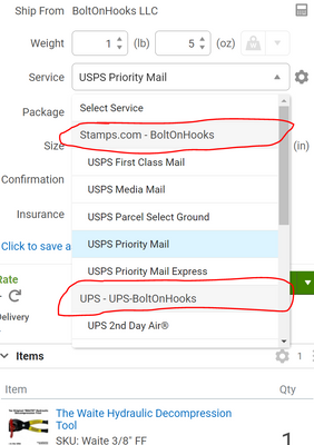
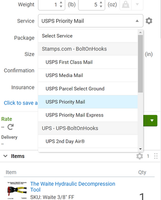
Davis, thanks for the reply. The biggest issue is the "sections" are not well separated, the grayed out box is so light (at least on my screen) it just blends in with the other boxes. If this could be made darker or somehow more obvious it would help a lot. See the two attached images.
- Mark as New
- Bookmark
- Subscribe
- Mute
- Subscribe to RSS Feed
- Permalink
- Report Inappropriate Content
08-09-2021 02:21 PM
Howdy @Kennyd! Thanks for getting back to me so quickly!
I do see what you mean about the colors not differentiating this enough from each other. While I can't make this change directly, I am absolutely getting this feedback with the proper channels to see if any sort of adjustment can be made.
I appreciate the screenshots!
Best regards,
- Mark as New
- Bookmark
- Subscribe
- Mute
- Subscribe to RSS Feed
- Permalink
- Report Inappropriate Content
08-09-2021 02:27 PM
If they could at least BOLD the text it would help some.
Thanks.
- Mark as New
- Bookmark
- Subscribe
- Mute
- Subscribe to RSS Feed
- Permalink
- Report Inappropriate Content
05-11-2022 03:57 PM
Feedback does not matter....They don't do anything to address concerns. I had a guy email me from SS that seemed like he wanted to help with some issues after I gave negative feedback, but nothing came of it and he stopped responding. Just like any other big company I guess...customer service sucks.
- Manually Marking Order As Shipped - Display Only Your Carriers Request in ShipStation Features
- Shipping Status for Returns changes to "In Transit" when label is created in Carrier Integrations
- TikTok Integration. New Requirement for USPS Labels from January 2026 in Order Source Integrations
- Allow "Other" option for Customs Declarations "Select Contents" in Carrier Integrations
- Automation Rules having more carrier options to select in ShipStation Features

